![]()
Logo
Elements
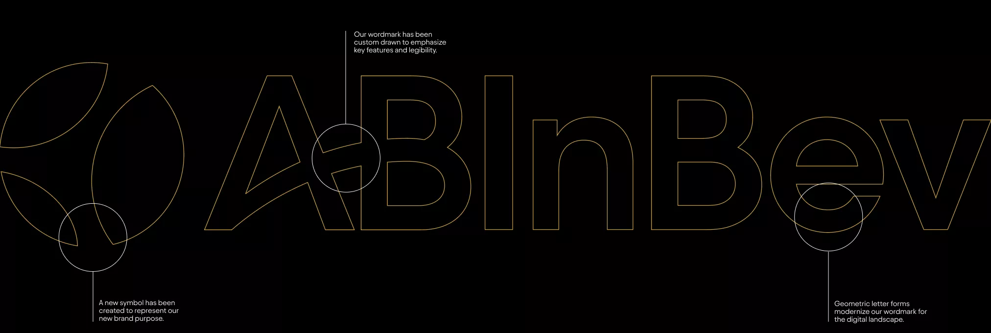
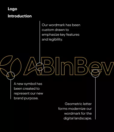
The AB InBev logo is the cornerstone of our brand. It is an important element from our toolkit that will help to establish brand recognition and presence. The logo is constructed of two key components; the symbol and the wordmark.
![]()
Meaning Behind our Symbol
Our symbol tells the story of our brand, bringing together our three key principles. The mark embodies the spirit of our mission and products.
Inclusive
Capturing the action of cheers. Bringing people together and lifting up communities
Natural
Our ingredients and our stewardship of the planet’s resources
Local
Our local roots and our global reach & distribution
![]()
Logo
Symbol
Shorthand
![]()
Logo Toolkit
Our logo system is flexible and dynamic, allowing a range of formats for different applications.
![]()
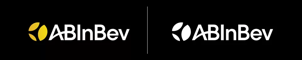
Logo Color Use
The different color variations of the logo consist of gold, black, and white. Use the color combinations listed here as a guide to ensure the logo has enough contrast.
![]()
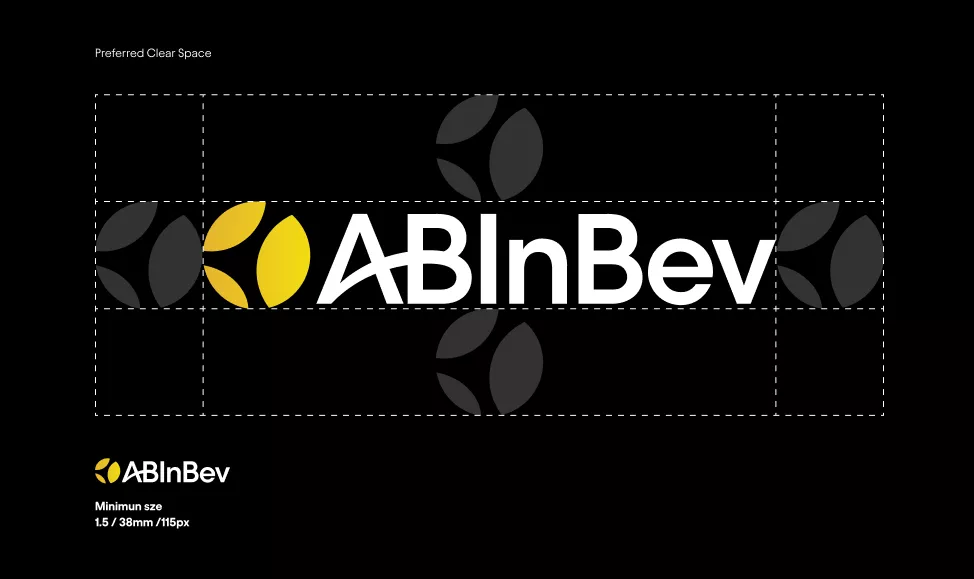
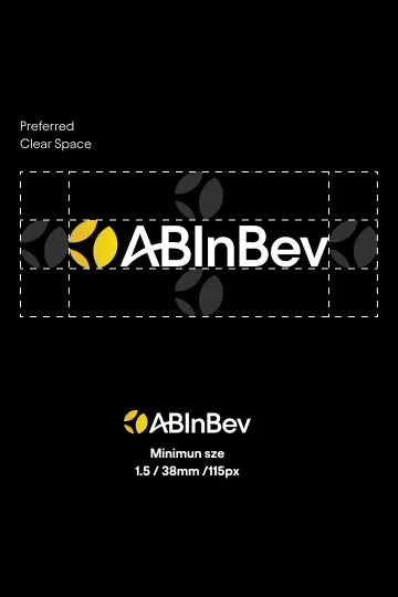
Spacing & Sizing
Proper clear space allows for the AB InBev logo to always be clear and legible. It is important for there to be a minimum amount of space around the logo to ensure that it is separated from headlines, copy, or imagery. Use our symbol as the measurement tool for clear space. This space should be equal on all four sides of the logo.
![]()
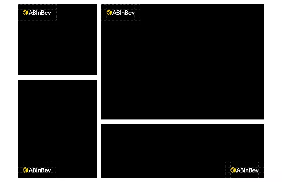
Logo Placement
Consistent placement across communications helps build equity in our logo. Whenever possible, use the AB Inbev logo in the top left corner, or as a sign-off at the bottom of the page.
![]()
![]()
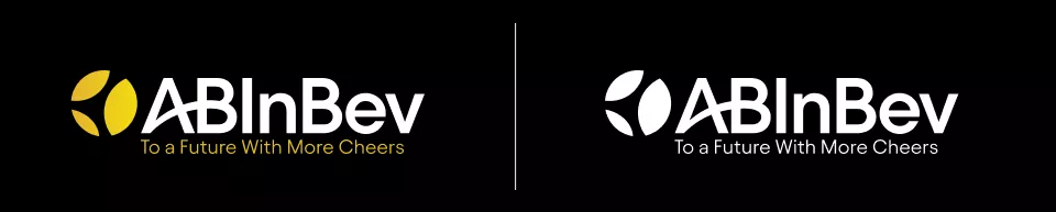
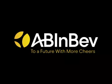
Tagline
Our tagline is an important asset that can be used to quickly communicate our purpose. For optimal impact, we recommend using it as a sign-off to a document or beneath the logo.

To a Future With More Cheers
![]()
Tagline Color Use
Use the examples shown here to insure proper contrast and legibility on different backgrounds
![]()
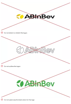
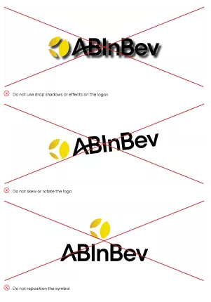
Incorrect Logo Use
The integrity of the AB InBev logo must be respected at all times. Please do not stretch, squeeze, or otherwise morph or manipulate the logo. Any modification of our logo confuses its meaning and diminishes its impact.

![]()
Symbol
The different color variations of our symbol consist of gold, black, and white. Use the color combinations listed here as a guide to ensure the symbol has enough contrast.

![]()
Symbol Expressions
Our symbol has the ability to hold various forms to communicate different initiatives, events, locations, and styles. This expression is to be used sparingly, and only with special permission from the brand and marketing team.
![]()
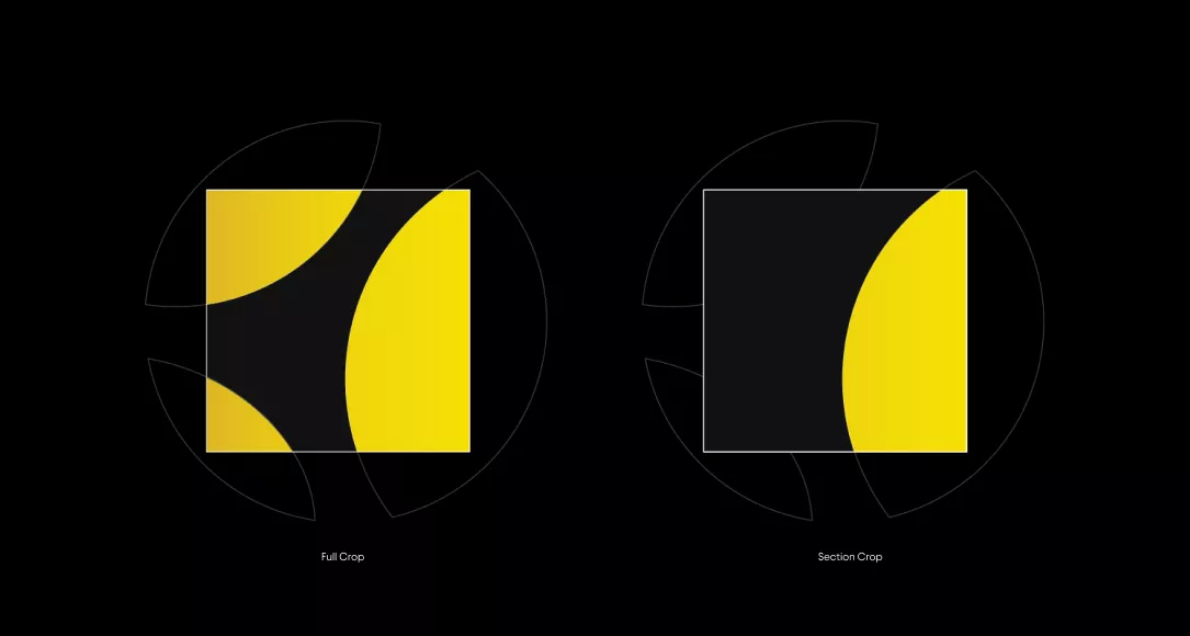
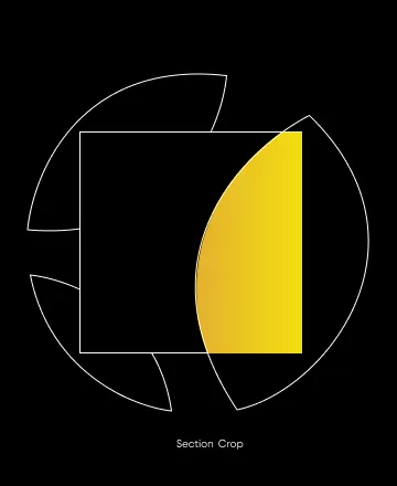
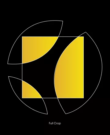
Graphic System & Composition Examples
Our graphic system is based on the dynamic curves of our symbol. To create compositions the symbol is enlarged to have the yellow areas hit each of the four corners of the layout.
Use the examples listed here as a guide to create dynamic and balanced compositions using our graphic system.

![]()
Patterning
Our pattern can be used as an asset to add texture and accents to color blocks and images. The patterns should be used sparingly on layouts with minimal text and graphics


![]()
Logo
Elements
The AB InBev logo is the cornerstone of our brand. It is an important element from our toolkit that will help to establish brand recognition and presence. The logo is constructed of two key components; the symbol and the wordmark.
![]()
![]()
Meaning Behind our Symbol
Our symbol tells the story of our brand, bringing together our three key principles. The mark embodies the spirit of our mission and products.
![]()
Inclusive
Capturing the action of cheers. Bringing people together and lifting up communities
![]()
Natural
Our ingredients and our stewardship of the planet’s resources
![]()
Local
Our local roots and our global reach & distribution
![]()
Logo Toolkit
Our logo system is flexible and dynamic, allowing a range of formats for different applications.
Logo
Symbol
Shorthand
![]()
Logo Color Use
The different color variations of the logo consist of gold, black, and white. Use the color combinations listed here as a guide to ensure the logo has enough contrast.
![]()
Spacing & Sizing
Proper clear space allows for the AB InBev logo to always be clear and legible. It is important for there to be a minimum amount of space around the logo to ensure that it is separated from headlines, copy, or imagery. Use our symbol as the measurement tool for clear space. This space should be equal on all four sides of the logo.
![]()
Logo Placement
Consistent placement across communications helps build equity in our logo. Whenever possible, use the AB Inbev logo in the top left corner, or as a sign-off at the bottom of the page.

![]()
![]()
Tagline
Our tagline is an important asset that can be used to quickly communicate our purpose. For optimal impact, we recommend using it as a sign-off to a document or beneath the logo.
To a Future With More Cheers
![]()
Tagline Color Use
Use the examples shown here to insure proper contrast and legibility on different backgrounds
![]()
Incorrect Logo Use
The integrity of the AB InBev logo must be respected at all times. Please do not stretch, squeeze, or otherwise morph or manipulate the logo. Any modification of our logo confuses its meaning and diminishes its impact.
![]()
Symbol
The different color variations of our symbol consist of gold, black, and white. Use the color combinations listed here as a guide to ensure the symbol has enough contrast.
![]()
Symbol Expressions
Our symbol has the ability to hold various forms to communicate different initiatives, events, locations, and styles. This expression is to be used sparingly, and only with special permission from the brand and marketing team.

![]()
Graphic System & Composition Examples
Our graphic system is based on the dynamic curves of our symbol. To create compositions the symbol is enlarged to have the yellow areas hit each of the four corners of the layout.
Use the examples listed here as a guide to create dynamic and balanced compositions using our graphic system.
![]()
Patterning
Our pattern can be used as an asset to add texture and accents to color blocks and images. The patterns should be used sparingly on layouts with minimal text and graphics